









Designing a magazine cover in 2026 means balancing strong visual storytelling with readability across both print and digital platforms. A great cover should catch attention instantly on a newsstand, in an app, or as a social media thumbnail.
1. Define the Magazine’s Identity
Before opening your design software, decide:
- Who is the audience?
- What is the magazine’s niche (fashion, business, technology, travel, etc.)?
- What emotions should the cover communicate?
- Will it be primarily print, digital, or both?
A consistent visual identity helps readers recognize your publication.
2. Start with a Strong Cover Image
Choose an image that:
- Is high resolution (300 DPI for print)
- Has a clear focal point
- Matches the issue’s main story
- Leaves room for headlines
Portraits with direct eye contact remain especially effective because they quickly capture attention.
3. Build a Clear Hierarchy
Readers should instantly know:
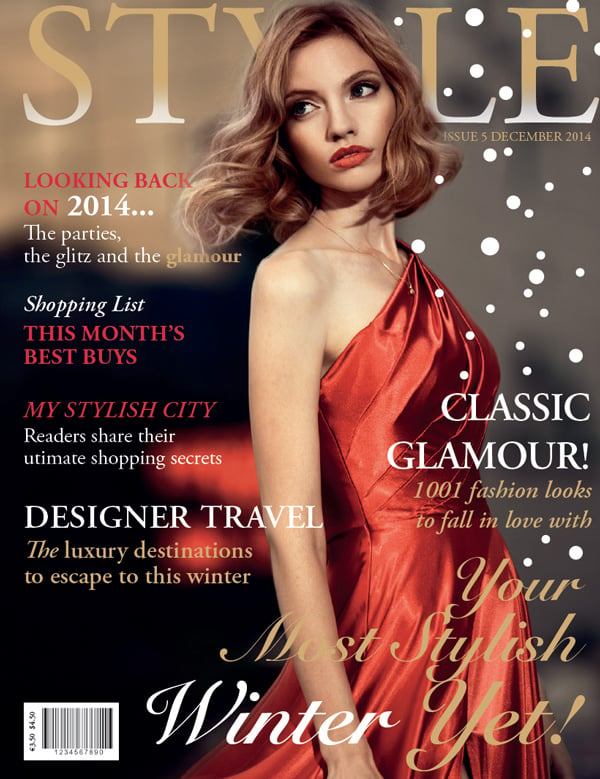
- Magazine title (masthead)
- Main cover story
- Supporting headlines
- Date and issue information
Use size, weight, and color to guide the eye.
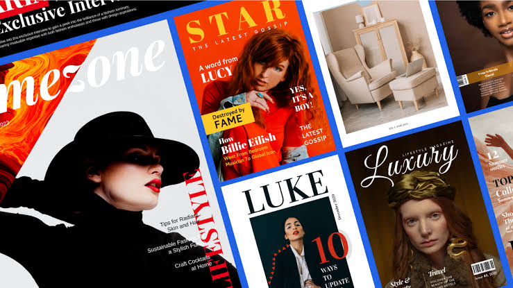
4. Use Modern Typography
In 2026, common typography trends include:
- Clean sans-serif fonts
- Variable fonts for flexible layouts
- Bold oversized headlines
- High contrast between headline and body text
- Limited font pairing (usually 2–3 fonts maximum)
Avoid cluttering the cover with too many different typefaces.
5. Choose an Effective Color Palette
Good magazine covers often use the following:
- One dominant color
- One accent color
- Neutral backgrounds when needed
Ensure text contrasts well against the image for easy readability.
6. Create Visual Balance
Arrange elements using a grid:
- Keep margins consistent.
- Align text carefully.
- Avoid covering important parts of the subject’s face.
7. Make the Main Headline Stand Out
Your primary headline should
- Be short
- Spark curiosity
- Highlight the biggest story
- Be readable even at thumbnail size
8. Include Essential Cover Elements
Most magazine covers contain:
- Masthead
- Date
- Issue number
- Main headline
- Secondary headlines
- Barcode (print editions)
- Website or QR code
- Price (if sold individually)
9. Design for Multiple Formats
Magazine covers are now viewed on:
- Mobile phones
- Tablets
- Desktop websites
- Social media
Test your cover at small sizes to ensure the title and main headline remain legible.
10. Add Modern Interactive Features
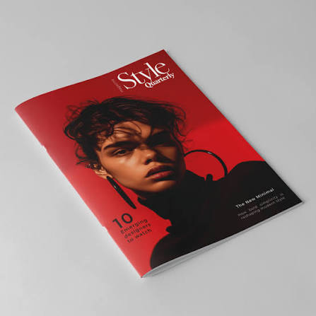
Many magazines now include the following:
- QR codes linking to videos or bonus content
- AR (augmented reality) experiences
- Exclusive digital interviews
- Audio versions of featured stories
These features can extend the reader’s experience beyond the printed page.
11. Use AI as a Design Assistant
Many designers use AI to:
- Generate layout ideas
- Remove backgrounds
- Upscale images
- Suggest color palettes
- Produce multiple cover variations quickly
AI can speed up exploration, but human judgment remains important for creating a distinctive editorial style.
12. Review Before Publishing
Check that:
- All text is spelled correctly.
- Images are licensed and high quality.
- Colors are print-safe (CMYK) for print editions.
- Important elements stay within safe margins.
- Bleed settings are correct.
- The cover remains effective both full-size and as a thumbnail.
Current Design Trends for 2026
- Minimalist layouts with bold typography
- Large editorial photography
- Vibrant yet limited color palettes
- Mixed print and digital branding
- High-contrast text overlays
- Creative text wrapping around subjects
- Subtle 3D and depth effects
- QR-enabled interactive experiences
- Consistent branding across social media and print
Tips and Best Practices to Help You Design a Magazine Cover
Designing a magazine cover is about balancing visual impact with clarity. Here are some practical tips and best practices:
1. Create a Strong Focal Point
- Use one compelling main image or illustration.
- Make sure the subject is high quality and immediately grabs attention.
- Avoid cluttering the cover with too many competing visuals.
2. Design a Memorable Masthead
- Keep the magazine title large and easy to read.
- Maintain consistent typography and placement across issues to build brand recognition.
- Ensure the masthead contrasts well with the background.
3. Write Attention-Grabbing Headlines
- Keep cover lines concise and engaging.
- Highlight the magazine’s most valuable stories.
- Use action words, numbers, and intriguing phrases when appropriate.
4. Establish a Clear Visual Hierarchy
- Make the most important elements stand out first.
- Use different font sizes, weights, and colors to guide the reader’s eye.
- Limit the number of headline levels to avoid confusion.
5. Choose Fonts Carefully
- Stick to two or three complementary typefaces.
- Ensure all text remains legible at a distance.
- Use bold fonts for major headlines and simpler fonts for supporting text.
6. Use a Cohesive Color Palette
- Select colors that match the magazine’s theme and audience.
- Maintain strong contrast between text and background.
- Use accent colors sparingly to emphasize key information.
7. Leave Plenty of White Space
- Avoid filling every inch of the page.
- White space improves readability and gives the design a polished appearance.
8. Keep the Layout Balanced
- Align text and images consistently.
- Use grids to organize elements.
- Avoid placing too many items on one side of the cover.
9. Feature the Most Important Story
- Give the lead story the largest and most prominent headline.
- Position it where readers naturally look first, often near the center or upper portion of the cover.
10. Consider the Target Audience
- Tailor imagery, colors, typography, and language to your intended readers.
- A business magazine, fashion magazine, and gaming magazine each require different visual styles.
11. Include Essential Cover Elements
Most magazine covers contain:
- Magazine title (masthead)
- Main cover image
- Lead headline
- Supporting cover lines
- Issue date
- Price
- Barcode (for print editions)
- Website or social media (optional)
12. Design for Both Print and Digital
- Ensure text remains readable on small mobile screens.
- Keep important content away from trim edges.
- Use high-resolution images (typically 300 DPI for print).
13. Maintain Brand Consistency
- Use consistent fonts, colors, and layout across issues.
- Preserve recognizable design elements while refreshing the content each edition.
14. Test Before Publishing
- View the cover at different sizes.
- Ask others what they notice first.
- Check for spelling, alignment, and readability before finalizing.
Common Mistakes to Avoid
- Overcrowding the cover with too much text.
- Using low-resolution or poorly cropped images.
- Choosing fonts that are difficult to read.
- Applying too many colors or font styles.
- Ignoring alignment and spacing.
- Making every headline the same size or emphasis.
- Poor contrast between text and background.
A successful magazine cover should capture attention within a few seconds, communicate the magazine’s identity, and encourage readers to pick it up or click to learn more.